

SNEAK PEEK COVER REVEAL “BLOOD TRIP”

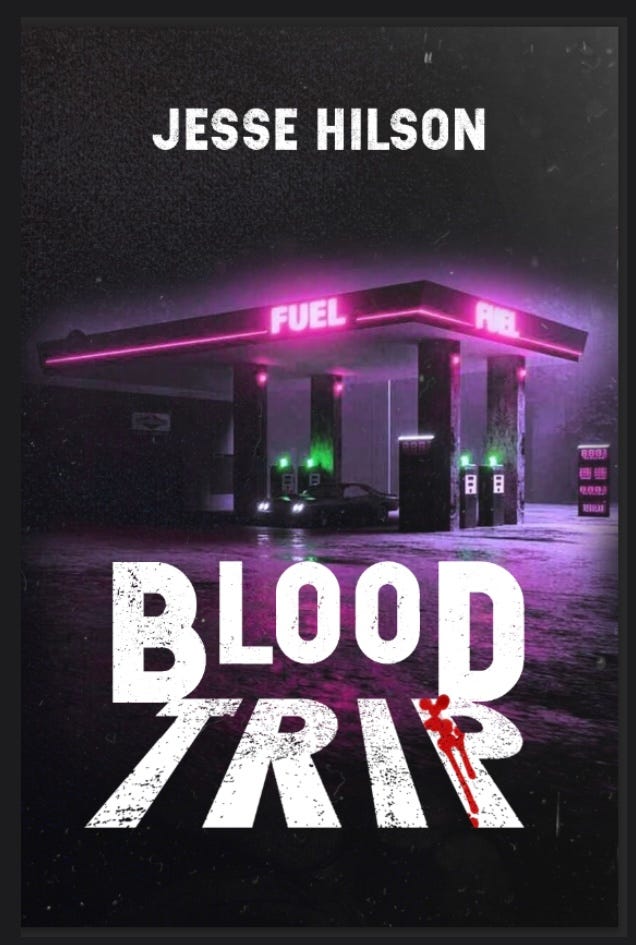
Because you’re all subscribers, I will give you a sneak peak at the proposed book cover for my novel Blood Trip which will be published by UK crime fiction publishers Close to the Bone in April. I will reveal it on twitter soon but I thought I’d do a tiered thing for subscribers. I’m happy with it, given the strictures of the situation. I could have drummed up the cash to hire a designer for a book cover but I didn’t act on that. It doesn’t matter. That may happen for future books. For now I’m enjoying the moody yet garish atmosphere of this. To me it feels like the font on the cover of a book should do some of the heavy lifting in getting the potential reader’s attention and communicating something about the book’s content. I like how the stretched foreshortening of the word TRIP suggests something projected on a road. The drops of blood on the letter P I was iffy about but I feel like it’s a concession to the pulpy nature of the affair and echoes the covers of schlocky horror movies I found at my local video store as a teenager. I am okay with a dip in the maturity level as that matches certain aspects of the novel and its genre. This is supposed to be fun.
It is my hope that when the novel is published in a couple months you as subscribers to my substack will strongly consider buying and enjoying it and finding entertainment in it, as in a way it’s of a piece with the impulse behind this substack—writing that is meant to please and divert you. And if I might humbly ask a favor of you as my expressly core readers, please don’t hesitate to spread the word about Blood Trip when it does come out and help me bring it to more readers. Thank you.
Exciting stuff 🖤
That looks great, Jesse!